


Whatever Happened to Back-of-the-Book Blurbs?
The worst trend to hit book cover design in recent years, that’s what.


It was a good, sensible, cloudy Saturday.
I was going to visit Crossword (an Indian bookshop chain, for my non-Indian readers) and let the scent of fresh paperbacks and hardbacks wash over me. The birds were excitedly chirping as if I were a Disney princess, and our pup Ginny was wagging her tail extra hard on seeing my face lit up like the Sirius binary system. There was hunger in my eyes, like that of a crack addict. One or two wouldn’t do. I wanted at least five books that day.
But the moment I crossed the threshold of the bookshop to browse the shelves, an odd feeling hit me. See, my process in selecting books—which I think everyone who loves to devour pages upon pages of a book (whatever their genre of poison might be) does—is fairly simple. Grab a deliciously pristine tome off a shelf, turn it around, and read the blurb.
Oh yes, it’s that taste of what the author brings as an experience before I nosedive into its crisp pages.
But lately, book covers are less about taking readers on this magnificent lick of a journey and more about what publications, book reviewers, and celebrity authors think.
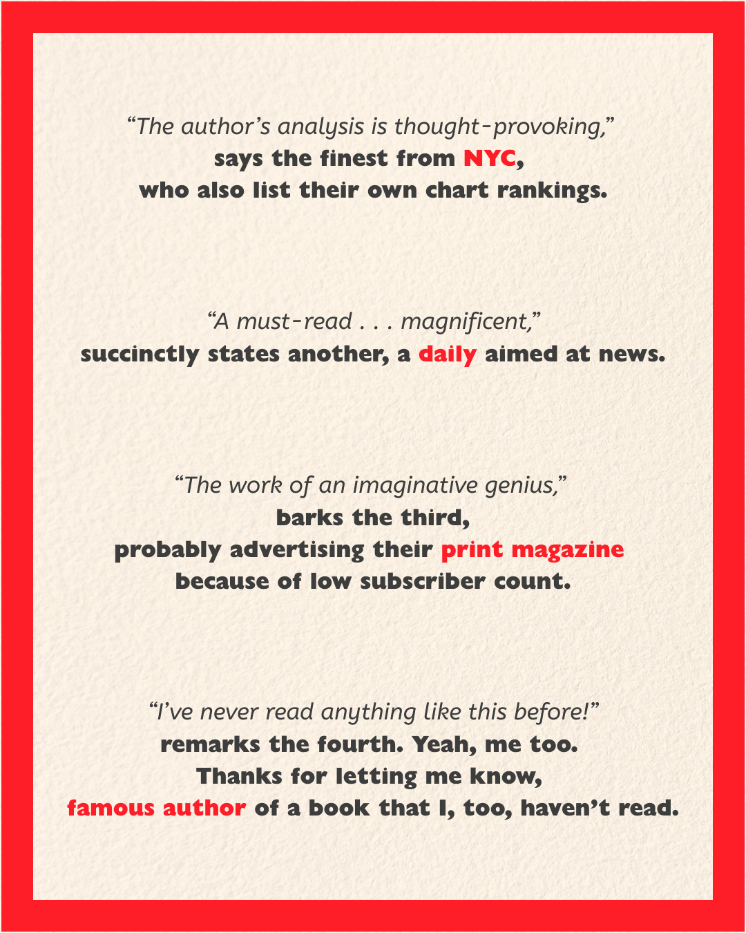
You see the pattern? It’s all senseless drivel of opinions meant to influence your own. What, pray tell, is the book about? No, you have to buy it to find that out, silly! The publisher isn’t going to spoil it for you.
“Fine Magnificence” Reads “Mindless Obsolescence”
In all my years of painstakingly building a library of my own (and becoming a collector of sorts), I had never encountered such a blasphemous attempt at defacing a beautiful piece of fiction or non-fiction for the sake of clout. I don’t care what the Sunday Times thinks about Samantha Harvey’s Orbital. Why don’t you just tell me so that I can judge the book by its cover? Huh?!
The book I’ve shared as the cover image for this post is Asako Yuzuki’s Butter. Back then, I couldn’t tell if it was something I wanted to read or not when I first took it in my hands in the Crossword store at the Sarath City Capital Mall in Hyderabad. Thankfully, and we’ll come back to this, the front cover had a hardback jacket-like appendage folding within that had exactly what I was looking for. I bought the book and thoroughly enjoyed it. Too much work, however, for what could have been achieved with a gentle arm twist and reading the back, don’t you think?
The sin of replacing a back blurb, which I feel is a consecrated DNA of book publishing for decades, with tall tales of people and publications that feel like smarmy badges of pats-on-the-back from within the industry is one of the greatest disservices to the reader.
See more examples:


I admit, not all books go down this path (thankfully, and the images below will lend strength to this argument), but those that do leave me with a sick taste in my mouth. The choice of covers below also gives two examples (the one of Culture by Martin Puchner gets clipped in the preview, sadly, and I’m too lazy to rework the grid) where a blurb is accompanied by an opinion. Sneaky publishers, am I right?


You might think I’m highly opinionated on this (I do love my book covers, okay? The opening paragraph of this piece should have given you an idea of how Gollum-like I am when it comes to a fine read). But hey, book shopping for me is akin to my wife’s obsession with tiny wearables for our baby. She goes gaga over booties, I go gaga over hardcover booty (Get it? Back of the book? Book’s booty? Fine, I’ll see myself out).
A Book Cover Renaissance?
Let’s go back to Butter.
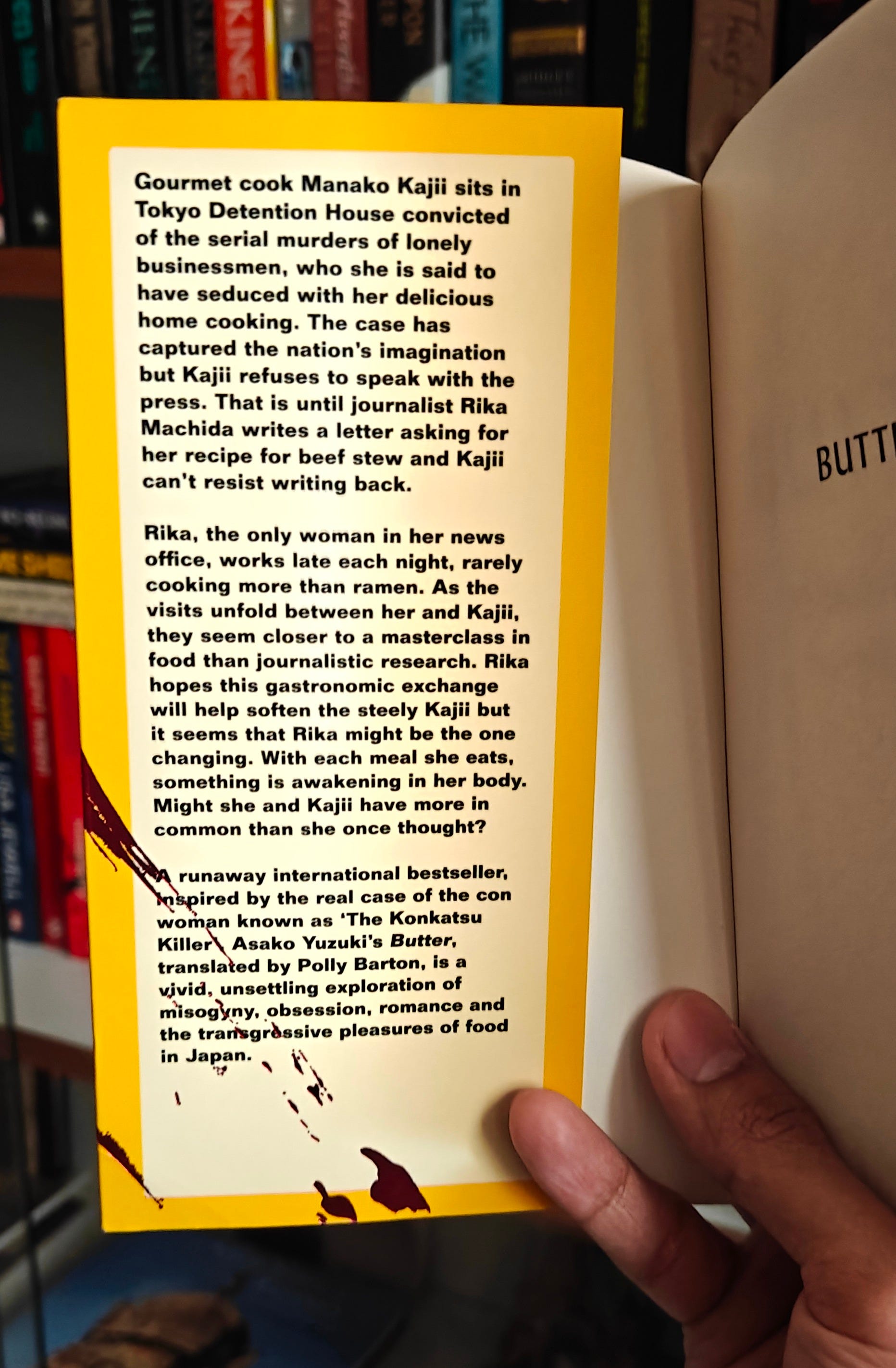
The jacket-like flap (or appendage, as I called it above) houses a brief of what the story is about. The subsequent decision this helped me make rewarded me with a wicked read (especially during the flights in my brief visit back home), hooking me in the more I turned the pages.
This new style of pseudo-jackets with blurbs inside is prevalent in every form, whether you read hardbacks or paperbacks.


It would be, however, rather spartan of me to categorize these new paperbacks as, well, paperbacks. I propose a new term for the stiffer, rubbery-textured, flexible covers that house book blurbs and author bios at the back appendage: flexibacks.
Anyway, I think—and believe with sincerity—that I’ve made my point. While these new covers do look inviting (and satisfy that hardback itch I keep running out of creams for), I still feel that it’s the back of the book that needs to be the rightful place of the essence of that book. It’s the one thing that drives my judgment and yours. Or so I hope.
But that’s what we do, isn’t it? Judge a book by its cover? No?
PS: All covers shown in this post are from books I own. The cover designs and blurbs are properties of their respective publishers, designers, and authors.
PPS: Enjoyed this piece? Don’t forget to hit the “like” button. It’s the sustenance a writer like me lives on.
I absolutely agree with you. Thankfully I never cared for reviews from famous authors or publishing houses etc. I honestly don't know why they add their reviews lol. There are no reviews on the back for wonderful novels written by Jane Austen etc yet it sells like hot cakes. Why? Because of the contents in it not because of some famous person reviewed it and gave it a 5/5!! That is how it should be.